Africa is really big.
° Africa area = 30,37 million km2
° China area = 9,6 million km2
° US area = 9,8 million km2
° Europa area = 10,18 million km2
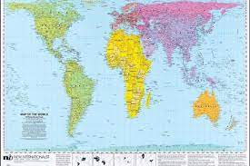
● Africa is bigger than all of Europe, China and the United States of America together.
● But on most world maps, Africa is represented in downsize.
This is deliberately done to create the visual effect of a small Africa to manipulate, brainwash, and deceive Africans wherever they are.
– Africa has 60% arable land.
– Africa owns 90% of raw material reserve.
– Africa owns 40% of the global gold reserve.
– Africa, 33% of diamond reserve.
– Africa has 80% of Coltan’s global reserve (mineral for telephone and electronics production), mainly in the Democratic Republic of Congo.
– Africa has 60% of global cobalt reserve (mineral for car battery manufacture).
– Africa is rich in oil and natural gas.
– Africa (Namibia) has the world’s richest fish coastline.
– Africa is rich in manganese, iron and wood.
– Africa is three times the area of China, three times the area of Europe, three times the United States of America.
– Africa has thirty-half million km2 (30 875 415 km2).
– Africa has 1,3 billion inhabitants (China has 1,4 billion inhabitants in 9,6 million km2).
Which means Africa is SUBPOPULATED.
– The arable lands of the Democratic Republic of Congo are capable of feeding all of Africa.
And all of Africa’s arable land is a cord to feed the whole world.
– The Democratic Republic of Congo has important rivers that can illuminate Africa.
The problem is that the CIA, western companies and some African puppets have destabilized DRC for decades.
– Africa is a culturally diverse continent in terms of dance, music, architecture, sculpture, etc.
– Africa accommodates 30.000 medicinal recipes and herbs that the West modifies in its laboratories.
– Africa has a young global population that should reach 2,5 billion by the year 2050.
The way that Africa is grossly under-depicted in western maps is because the projection these maps use has traditionally been based on the Mercator projection which took a Eurocentric perspective. This inflated the relative size of European countries vis a vis Africa.
In 1973 the German filmmaker, historian and journalist, Arno Peters, announced that he had developed a map based on a different projection that provided a better relative comparative depiction of the mass of Europe and Africa.
About ten years after Peters had announced his new map, in the Map Department of the British Library there were already signs that Peters maps were supplanting maps using the more traditional map though they still remained the popular preference among the majority of map publishers such as Stanford’s.
